
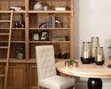
A bookcase is one of the most powerful surfaces in any room — and one of the most consistently under-used. Most of us arrange our books in some rough order of size, prop a framed photo at one end and leave the rest to chance. Then we stand back, feel vaguely dissatisfied, and assume the problem is that we don't have enough things.
We do. The problem is almost never a lack of objects. It's a lack of the framework that professional interior designers use to turn a collection of everyday things into something that looks genuinely, deliberately beautiful.
That framework is learnable. And once you understand it, you'll see it everywhere — in every beautifully styled shelf in every magazine, on every Pinterest board you've ever saved. It's the same set of principles, applied with confidence. Here they are.
Before You Start: Edit Ruthlessly
The single most important thing you can do before you style a bookcase is remove things from it. Not permanently — just temporarily. Take everything off every shelf and start with a completely empty bookcase.
This sounds counterintuitive. But it is the only way to see what you actually have to work with, and to resist the temptation to put things back where they were simply because that's where they lived before. An empty bookcase is a blank canvas. A full one is an obstacle course.
Once everything is off, sort your objects into three piles: things you genuinely love and want to display, things that are functional but not beautiful, and things you're keeping out of habit. Only the first pile goes back on the shelves. The second pile gets stored. The third pile deserves an honest conversation with itself.
Before: the common mistakes
- Every book upright, end to end, all the same height
- Objects crammed together with no breathing space
- All accessories at the same scale
- No variation in height across the shelves
- Random mix of frames, objects and paperwork
- Nothing that draws the eye as a focal point
After: the designer approach
- Books grouped in horizontal stacks and vertical runs
- Generous space between groupings
- Objects in varied scales — tall, mid, low
- Each shelf has its own distinct composition
- A single material thread (texture, finish) ties it together
- One standout object per shelf as an anchor
Step 01
Anchor with Books — But Not the Way You Think
Books are the backbone of a bookcase. But the way most people arrange them — all upright, all roughly the same height, running from one end to the other — is the least interesting thing you can do with them.
Interior designers use books in two distinct ways: vertically (spines out, in grouped runs of colour or size) and horizontally (stacked flat to create a platform for objects placed on top). Both approaches are more visually interesting than a continuous row of upright spines, and both give you far more compositional flexibility.
- Group books by colour or tone rather than by subject or alphabetically. A cluster of cream and ivory spines next to a cluster of dark navy or forest green creates a naturally editorial quality.
- Mix upright and horizontal stacks on the same shelf. Two or three books stacked flat become an elevated plinth for an object on top — a sculpture, a vase, a candle.
- Remove the dust jackets from hardback books for an instant upgrade. The cloth or board covers underneath are almost always more beautiful and more tonally consistent.
- Face some books the wrong way (pages out, spine inward). A small group of books with pages facing forward creates a beautiful creamy texture that breaks up a run of colourful spines.
The stack trick: A horizontal stack of three to five books creates a riser that elevates an object to exactly the right height for its shelf. It's one of the most-used techniques in professional styling — and it uses things you already own.
Use the Rule of Three for Every Grouping
The rule of three is the most reliable principle in interior styling. Objects grouped in threes — at different heights, in different materials — are almost always more visually satisfying than pairs or solitary pieces. It's an odd number, and odd numbers create visual tension that the eye finds naturally interesting.
On a bookcase shelf, a grouping of three might look like: a tall vase, a mid-height sculpture, and a short stack of books. Or a framed print leaning at the back, a small object in the middle ground, and a candle in the foreground. The exact combination matters less than the principle — three distinct objects, three distinct heights, with some variation in form and material between them.
The designer shortcut: If a grouping doesn't feel right, add or remove one object. Almost always, going from two to three, or from four to three, solves it immediately.
Step 03
Vary Heights Across Every Shelf
A bookcase where every shelf is styled at the same visual height — where everything sits level and nothing rises above or dips below its neighbours — looks flat and rigid. The eye moves across it quickly and finds nothing to rest on. It reads as furniture rather than as a composition.
The fix is deliberate height variation. On each shelf, aim to have at least one tall element, one mid element and one low element. Across the whole bookcase, vary which shelves feel heavier and which feel lighter. A heavily layered lower shelf and a more spare upper shelf creates rhythm. Alternating dense and spare shelves has the same effect. What you want to avoid is uniformity — every shelf at exactly the same visual weight.
- Tall elements: a large vase, a framed print leaning at the back, a tall candlestick, a stack of oversized books standing upright
- Mid elements: a sculpture, a small framed photo, a decorative object of medium scale, a potted plant
- Low elements: a candle on a horizontal book stack, a small ceramic bowl, a single object placed in the foreground
Use a book stack as a riser: If your tallest object on a shelf isn't quite tall enough to create proper height contrast, place it on a horizontal stack of three books. This raises it by 8–12cm and immediately changes the composition. It's the stylist's most-used trick on a bookcase.
Step 04
Layer in Texture — the Material Mix
Texture is what gives a styled bookcase its quality. A shelf that has only smooth, shiny surfaces looks cold and corporate. A shelf that has only matte surfaces lacks life. The most considered shelves mix both — and vary the tactile quality of objects as deliberately as they vary height.
Think of it in terms of material families: smooth metal alongside raw ceramic, polished glass next to rough linen-covered books, matte sculpture beside a glossy vase. Each material makes its neighbour look more interesting by contrast. This is why a single finish throughout — everything gold, or everything white — rarely works as well as it should. The finish needs something to play against.
"The most beautiful shelves are never monochrome. They are conversations between materials — each texture making the others more interesting."
The material mix to aim for
- Metal: A sculptural or decorative piece in a warm metallic finish — gold, burnished brass or matte bronze — adds richness and reflects light at every time of day
- Natural: A small plant, a woven basket, a ceramic object or a piece of driftwood adds organic texture that softens the precision of metal and glass
- Printed: Books, a framed art print or a small piece of wall art leaned at the back of the shelf adds flat pattern that creates visual depth
- Reflective: A small mirror, a piece of glass, or a polished metal surface bounces light and prevents the shelf from feeling heavy
Nason Gold Disc Design Wall Art
Leaned at the back of a shelf rather than hung on the wall, the Nason introduces a graphic, framed element that gives the arrangement a layer of depth. The textured gold frame and white mount sit beautifully against book spines in natural and cream tones — a simple, elegant way to introduce art into a bookcase composition without committing it to the wall.
Give Every Shelf a Focal Point
In a well-styled bookcase, each shelf has one element that the eye gravitates towards first — something that anchors the composition and makes the shelf feel intentional rather than accumulated. Without a focal point, the eye doesn't know where to land. With one, it settles immediately and then explores the surrounding arrangement with pleasure.
The focal point doesn't need to be the largest object. It needs to be the most visually interesting one — the piece with the most character, the one that tells the viewer something about who you are. A beautiful sculpture. A piece of art. An unusual vase. A meaningful object. Whatever it is, let it lead, and let everything else on that shelf support rather than compete with it.
One focal point per shelf. The temptation is to include several statement pieces — but two focal points on the same shelf compete with each other and neither wins. Choose one object to lead each shelf and let the rest of the composition support it. Save your other statement pieces for different shelves.
Step 06
Leave Breathing Space — Empty Space Is Not Wasted Space
This is the principle that separates a professionally styled bookcase from a crowded one, and it's the hardest to trust. Empty space on a shelf feels like a problem to be solved — an obvious gap that needs filling. But deliberately leaving space between groupings is what makes the groupings themselves visible, and what gives the eye the pause it needs to appreciate each one in turn.
Think of it the way you'd think of white space in graphic design. The space around an object is not the absence of design. It's part of the design. It gives the object presence. A sculpture with 15cm of clear shelf space around it reads entirely differently from the same sculpture crammed between books on both sides. The first has authority. The second is just another object in a crowd.
- Aim for at least 20–30% of every shelf to be empty — not concentrated at one end, but distributed as breathing space between and around groupings
- Leave more space on upper shelves — the eye reads upper shelves as lighter and more airy, which creates a natural visual balance with heavier, more object-dense lower shelves
- Never fill a shelf to the edge — leaving a small gap at each end of a shelf arrangement creates a natural frame around the composition
Step 07
Dress It Shelf by Shelf — The Complete Blueprint
Now that the principles are in place, here is how to apply them shelf by shelf across a standard four- or five-shelf bookcase. This is the structure that interior designers work to — it gives every shelf a distinct character while keeping the bookcase coherent as a whole.
The designer shelf-by-shelf blueprint
Top shelf - Keep it light and spare. One or two objects maximum — a small vase with a single dried stem, or a sculptural object on its own. Upper shelves read as the lightest part of the bookcase; over-filling them makes the whole piece feel top-heavy. This is often the most visible shelf from across the room, so make it the most restrained.
Second shelf
Art and architecture. This is the ideal position for a framed print or piece of art leaned at the back — it's at or just above eye height from a seated position, which is where art looks best. Frame it with a run of books on one side, a sculptural object on a book stack on the other, and leave generous space in the middle.
Middle shelf
The hero shelf — your main focal point lives here. Eye height from standing, this is the shelf people see first and look at longest. Place your most significant object here — your most beautiful sculpture, your most striking vase. Support it with a smaller grouping on one side and books on the other. This shelf should feel the most considered.
Fourth shelf
Books and layering. A mostly book-led shelf with one or two objects woven in — a candle, a small ceramic or a trailing plant. This shelf provides visual mass and grounds the upper, lighter shelves. Horizontal stacks work well here alongside upright runs of books in tonal groupings.
Bottom shelf
The heaviest, most grounded level. Larger objects — a stack of oversized books, a larger vase or basket, a trailing plant — sit naturally here. The bottom shelf can take the most visual weight without making the bookcase feel unstable. Consider a larger sculptural object or basket here that you wouldn't put higher up.
Estrella Large Fluted Vase — Middle or Bottom Shelf
The Estrella's scale and presence make it a natural hero for either the middle shelf focal point position or the grounding element on the lowest shelf. Its gold fluted form catches light from any angle — on the middle shelf it commands the eye; on the bottom shelf it anchors the whole bookcase. Either way, it earns its position without competing with the objects around it.
Nason Gold Disc Design Wall Art — Second Shelf, Leaned
Rather than hanging the Nason on a wall, lean it at the back of your second shelf for a layered, editorial effect. The slim gold frame and white mount sit beautifully behind a sculpture or object placed in front of it, creating exactly the kind of depth and composition that makes a bookcase feel professionally dressed.
Milton Metal Sculpture — Middle Shelf Focal Point
The Milton on its acrylic stand is made for the hero shelf position — placed slightly off-centre at eye height, with books framing it on one side and breathing space on the other. The floating quality of the acrylic base is most apparent at this level, making the sculpture appear to hover in the composition rather than sit within it.
Prato Gold Finish Jack Sculpture — Second or Third Shelf
The Prato rewards proximity — it's at its best when at or near eye height, where its tactile, irregular form can be appreciated closely. Place it on a horizontal book stack on the second or third shelf, slightly off-centre, with a smaller object to one side. The gold finish catches the warm tones of surrounding book spines and neutral shelf paint beautifully.
The Thread That Ties It All Together
A bookcase where every shelf is beautifully composed but nothing visually connects them can feel disjointed — like seven separate displays rather than one considered whole. The solution is a material thread: a single finish, colour or texture that appears on every shelf in some form, creating continuity as the eye travels up and down.
In 2026, the finish doing this work most effectively in the interiors designers are creating is warm gold. Not uniform, identical gold — but gold as a recurring note: a sculptural object on one shelf, a framed piece on another, a vase further down. Each one slightly different in form and finish, but tonally united. The eye reads the thread and the bookcase reads as a whole.
This is also why a bookcase styled entirely in one material — all white ceramics, or all natural wood — can feel slightly flat. The thread should appear across the shelves, not dominate any single one. The gold catches the eye; the neutral surroundings give it space to do so.
Your gold thread across the shelves: Milton on the middle hero shelf. Nason art piece leaned on the second shelf. Prato sculpture on a book stack on the third. Estrella vase anchoring the bottom. Each shelf has its own character; gold ties them all together. This is the exact principle professional stylists use — one material, multiple forms, distributed across the composition.
Shop the Bookcase Edit
Every piece featured in this guide — available now at Photogenic Home
Estrella Large Fluted Vase
Prato Gold Finish Jack Sculpture
Milton Metal Sculpture on Acrylic Stand
Nason Gold Disc Design Wall Art
View All Home Accessories
Frequently Asked Questions
The bookcase styling questions people ask most.
How do interior designers style a bookcase?
Interior designers follow a consistent set of principles: they edit ruthlessly before they start, arrange books in tonal groupings rather than alphabetically, use the rule of three for every object grouping, vary heights across each shelf, and leave generous breathing space between objects. They also ensure each shelf has one focal point and use a consistent material thread — a finish or colour that appears on every shelf — to tie the whole bookcase together as a single composition.
What should I put on my bookcase besides books?
The most effective bookcase accessories are objects with visual weight and distinct form: sculptural pieces, framed art or prints leaned at the back of a shelf, vases (with or without stems), candles, small plants or dried botanicals, and decorative objects in varied materials. The key is to choose pieces that differ in height, texture and material from one another — a smooth sculpture next to rough book spines, a reflective metallic object next to a matte ceramic — so that each one makes the others more interesting by contrast.
How do I make my bookcase look less cluttered?
Remove at least a third of what's currently on it. Clustering is almost always the cause of a cluttered bookcase — too many objects at similar heights and scales with no breathing space between them. After editing, group what remains into deliberate compositions of two or three objects, leave generous space between each grouping, and resist the urge to fill gaps. The empty space is doing as much work as the objects.
How do I arrange books on a bookcase to make it look good?
Group books by colour or tone rather than by subject — clusters of similar-toned spines create a naturally editorial quality. Mix upright and horizontal stacks: a horizontal stack of three to five books becomes an elevated platform for a sculpture or object placed on top. For a particularly refined look, remove dust jackets from hardbacks and consider turning a small group of books with pages facing outward — the creamy texture of pages creates beautiful contrast against coloured spines.
Should a bookcase be symmetrical or asymmetrical?
Asymmetrical is almost always more interesting. Perfect symmetry on a bookcase reads as formulaic and slightly rigid. Asymmetrical compositions — where the visual weight shifts slightly from shelf to shelf, where objects are placed off-centre rather than precisely in the middle — feel more considered and more personal. That said, a loose symmetry can work well on very wide bookcases where the eye needs anchoring points on both sides.
What is the rule of three in bookcase styling?
The rule of three is the principle that objects grouped in odd numbers — particularly threes — are more visually satisfying than pairs or solitary pieces. On a bookcase shelf, a grouping of three objects at three different heights (tall, mid, low) creates natural visual tension and interest that the eye finds pleasing. It's the same principle used in flower arranging, graphic design and photography, and it works consistently on bookshelves because it prevents compositions from feeling either too sparse or too symmetrical.


