

Gold is having a moment — and not a fleeting one. Across the most influential interiors of 2026, to the feeds of the designers one finish keeps reappearing: warm, considered, beautifully textural gold.
It has become the secret ingredient that separates a room that looks good from one that looks genuinely extraordinary. Not because it dominates — but because it adds that elusive quality that neutral interiors can sometimes miss: warmth, richness, a sense that every detail has been chosen with intention.
Think of the way afternoon light catches the edge of a burnished mirror frame, or the quiet confidence of a sculptural gold vase anchoring a sideboard. Gold, used well, is the finish that makes a room feel complete — layered, elevated and entirely its own.
The best part? Achieving that look is less about spending more and more about choosing with purpose. Here's how to bring gold into your home so it looks effortlessly chic.
Think of Gold as a Finish, Not a Colour
The most useful shift in how you think about gold is to stop treating it as a colour and start treating it as a finish — like the sheen on an aged mirror, the patina on a brass handle, or the warm reflection of firelight on a wall.
When gold functions as a finish rather than a dominant hue, it sits within a neutral palette rather than sitting on top of it. Your walls, upholstery and larger furniture pieces remain calm and grounded. The gold picks out the details: the edge of a frame, the curve of a vase, the leg of a chair.
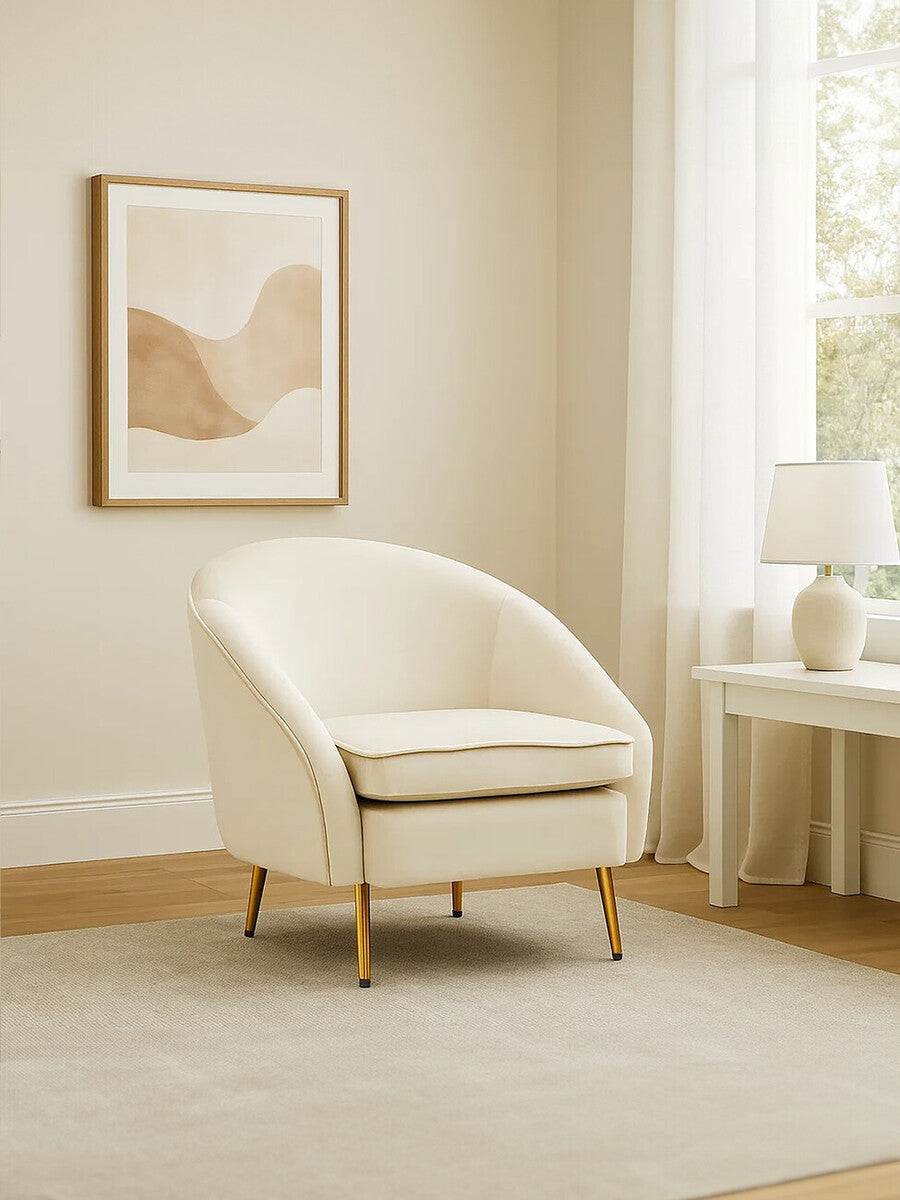
This is the principle that makes the Yasmeen Beige Velvet Armchair work as beautifully as it does.
 Yasmeen Beige Velvet Armchair
A luxurious beige velvet upholstery in a sleek tub-style silhouette, finished with refined piped edging and elegant gold-finished angular legs. The body does the grounding; the legs do the glinting.
The chair itself is a quiet, neutral thing. The gold is only on the legs — a single material decision that elevates the whole piece from pleasant to considered. This is the template: let the majority of the object be calm. Let the gold be the final, precise note.
Choose Texture Over Shine
The gold commanding attention in the most stylish homes right now is matte, burnished and richly textural — surfaces that catch light softly and hold it beautifully. This is the finish that interior designers have quietly been reaching for, and it's easy to see why: it has a depth and warmth that feels genuinely luxurious.
Textured gold reads as material rather than merely metallic. When it's applied to objects with genuine craft behind them — handmade, considered, built to last — the result is something that feels collected over time rather than bought all at once.
On the Wall
 Akola Gold Wall Mirror
A richly textured gold frame that evokes the raw elegance of natural stone and molten metal. The tactile, uneven surface creates visual interest and dimension — particularly striking in a hallway or above a fireplace.
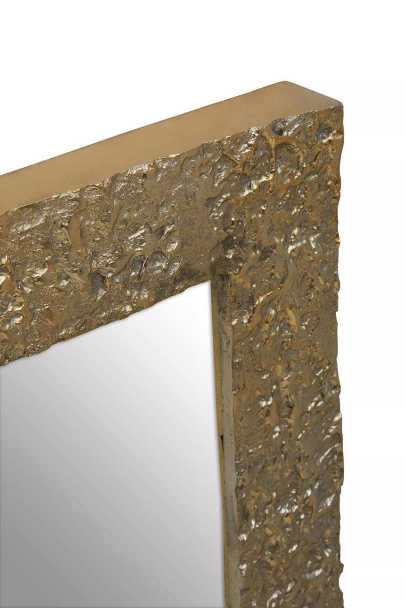
A mirror like this one earns its place not simply because it's gold, but because the frame is itself an object of interest. The texture catches light differently at different times of day, making it genuinely dynamic. Position it where natural light can reach it — a hallway wall opposite a window, or above a console table where morning light travels across it.

Nason Gold Disc Design Wall Art
A slim rectangular frame with a textured gold finish and crisp white mount. Understated but quietly compelling — the kind of piece that rewards a second look.
Wall art in gold doesn't need to be elaborate. The Nason's strength is its restraint — the texture on the frame provides the visual interest; the white mount gives it room to breathe. Group it with one or two other pieces of a similar quiet character for a gallery wall that feels curated rather than crowded.
Bring Gold Into Three Dimensions
Flat gold — in frames, prints and tiles — is one thing. But the most interesting gold interiors almost always include objects that occupy space: sculptures, vessels, statement accessories that introduce form as well as finish.
This is where gold becomes genuinely alive in a room, because sculptural pieces catch and respond to light in ways that wall-hung pieces cannot.
The Sculptures
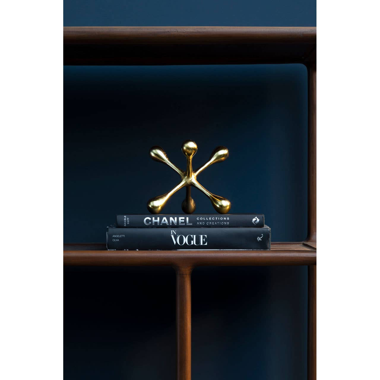
Prato Gold Finish Jack Sculpture
Handcrafted and cast in aluminium, this striking piece brings an artisanal quality to any surface. Its irregular, geometric form is the kind of object people reach for and turn over in their hands.

Milton Metal Sculpture on Acrylic Stand
Sleek metal rods extending from a central sphere in a warm gold finish, mounted on a transparent acrylic plinth. The acrylic base all but disappears, making the sculpture appear to float. Works particularly well in modern or paired-back interiors.
These two pieces represent opposite ends of the sculptural spectrum — the Prato is organic and tactile; the Milton is precise and graphic. Using both in the same space, at different heights, creates a dialogue between the two that makes a shelf or console feel considered rather than collected.
The Vase

Estrella Large Fluted Vase
Handcrafted from robust aluminium with a gold finish effect that exudes vibrancy. The fluted detailing creates a sculptural statement even when empty; the round standalone base gives it stability and visual weight.
A vase of this scale doesn't need flowers to justify its presence. The Estrella is an object in its own right — use it empty on a sideboard, or with a single stem of dried pampas or bleached botanicals if you want softness without colour. The gold finish adds warmth; the fluting adds texture. It's the rare piece that photographs as well as it lives in person.
Let Gold Anchor the Functional
One of the most effective moves in interior design is to make functional objects — the fruit bowl, the side table, the storage piece — beautiful enough that they become part of the room's overall composition rather than afterthoughts to it.
Gold is particularly well suited to this approach because it elevates without complicating. An object gains a layer of considered intention simply by being finished in the right material.
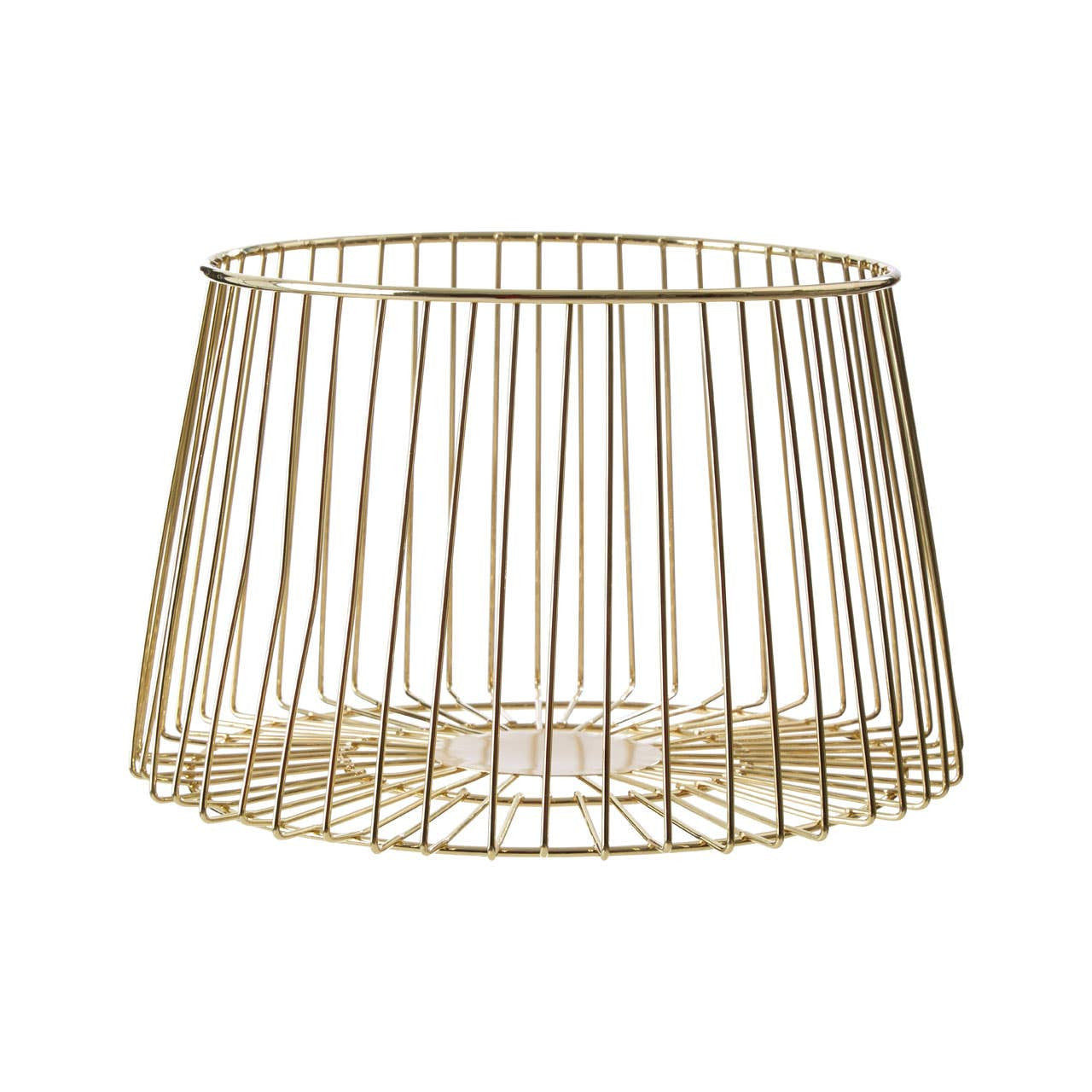
Vertex Deco Matte Gold Large Fruit Basket
Crafted from delicate metal wires in a refined tapered silhouette, this brings understated elegance to the kitchen or dining table. Leave it with fruit for a warm domestic still life, or use it as a catch-all for smaller objects on a sideboard.
The Vertex basket is the perfect example of gold doing quiet, practical work. It's the kind of piece that visitors notice and comment on — not because it's extravagant, but because it's unexpectedly beautiful for an everyday object. That is the definition of sophisticated decorating.

Jodie Set of Two White Marble and Gold Frame Side Tables
A pair of sophisticated accent tables, each with a pristine white marble top paired with a striking gold-toned metal frame. Nest them beside a sofa or armchair, or use them independently in different rooms.
Marble and gold is one of the most enduringly elegant material pairings in interior design — there is a reason it has appeared in every era of great decorating. The Jodie tables bring this pairing into a contemporary scale: slender-framed, marble-topped, and versatile enough to move freely through the home. The gold frames are visible primarily from the side — a detail that rewards real life more than photography.
The Styling Principles That Make Gold Sing
The most chic gold interiors share a common thread: they are intentional. Every piece earns its place, every finish is chosen with care, and the result feels like a beautifully edited whole rather than a happy accident. These are the principles that get you there.
Keep these in mind as you build your look:
- Choose a few intentional gold moments per room. A mirror, a sculpture, a vase, a furniture leg — each one purposeful, each one earning its place.
- Vary the finish for depth. Matte gold, brushed gold and a more lustrous accent in the same space creates a beautifully layered look that feels considered and personal.
- Let neutrals set the scene. Stone, linen, oatmeal, chalk, natural wood — these are the backdrop that allows gold to glow at its most beautiful.
- Celebrate natural materials. Gold is at its most luxurious alongside natural stone, aged timber and raw ceramics — combinations that feel rich, grounded and thoroughly elegant.
- Work with the light. Gold moves beautifully with natural light over the course of the day. Place your key pieces where they'll catch morning or afternoon sun for a truly stunning effect.
- Coordinate rather than match. Mix textures, scales and forms within the same warm tonal family — the result is a room that looks styled by someone with a genuine eye.

Shop the Edit
- Akola Gold Wall Mirror
- Nason Gold Disc Design Wall Art
- Prato Gold Finish Jack Sculpture
- Milton Metal Sculpture on Acrylic Stand
- Estrella Large Fluted Vase
- Vertex Deco Matte Gold Large Fruit Basket
- Yasmeen Beige Velvet Armchair
- Jodie Set of Two White Marble and Gold Frame Side Tables
Hyperlink each product name above to its corresponding product page in Shopify.
Frequently Asked Questions
Is gold home decor still in style in 2026?
Absolutely yes — but the gold that's resonating now is warmer, more textural and slightly more restrained than the high-gloss versions of previous decades. Matte and brushed finishes, sculptural forms and pieces that pair gold with natural materials like marble and linen are particularly strong.
How do interior designers style gold so it looks so effortless?
The key is intentionality — choosing three or four considered gold moments in a room rather than decorating with a single finish throughout. A mirror, a sculpture, a vase and a furniture detail, each in a slightly different texture, creates a look that feels curated and genuinely beautiful. Letting warm neutrals carry the larger surfaces gives each gold piece the space to shine.
What colours work best with gold in a home?
Warm neutrals (oatmeal, stone, chalk, warm white) work best because they reflect and amplify the warmth of gold without competing with it. Deep tones — navy, forest green, charcoal — can also pair beautifully for a more dramatic, evening-focused look.
What's the difference between gold, brass and champagne in home decor?
In broad terms: brass is warmer and has a slightly yellow-green undertone; gold tends to be brighter and more reflective; champagne is a lighter, paler almost silvery-warm tone. All three sit within the same tonal family and can work beautifully together in the same space if the finishes and pieces are chosen thoughtfully.


